
Understanding Modern Website Design
A good website is not just about how it looks. It should also give the user a good experience. Website design today is based on strong rules that help your site work on many screen sizes and reach more people. You need to make sure your website keeps users interested and works well on all devices, like phones and computers. Using responsive web design and putting the user first will help your site be better, more open to everyone, and keep people coming back.
Now, let’s talk about what makes for good web design in this time when user experience is so important.
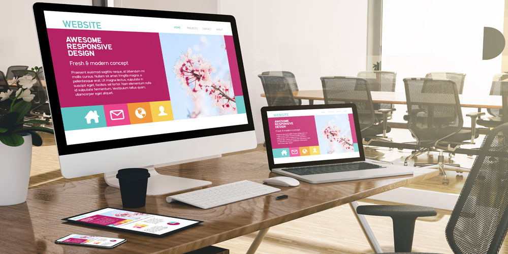
Good website design starts with knowing how people use your content on different devices. This is the main idea behind responsive web design. It is important to make your website work well on both big computer screens and small smartphone screens. Changing the layout helps with usability. It also keeps your website looking and working the same way across all devices.
When you follow web design best practices like mobile-first design and use CSS media queries to update your layouts, you can keep up with changes in how people use websites. Responsive web design and being adaptable are very important for brands. It helps them reach and keep more people, no matter what devices they use.
What Defines “Good” Web Design Today?
Good web design is all about making the site look good and work well for people who use it. It should catch the eye, be easy to use, and work on any device. A responsive design will help people use the site on their phones, tablets, and computers because it changes the layout and content to fit any screen space.
The navigation is important in web design. Menus, buttons, and links should be easy to find and use. It is good to have things that help people move around the site without getting lost. For example, hamburger menus work well on smaller screens. These menus help mobile users move in and out fast and keep the site neat.
How fast your site loads is also a big part of its success. People will leave if a site is slow to open, so speed matters a lot. Make your site work better and faster by using images that are not too heavy and using flexible visuals. This way, you keep the visual identity strong and the functionality good. A great site stands out when it is easy to use and looks good everywhere.
How User Expectations Have Evolved
User expectations have gone up a lot because of the fast changes in technology. Today, mobile users want websites that work well, no matter if they use a smartphone, tablet, or desktop.
Now, more than 60% of website visits come from mobile devices. Web pages must work and look good on smaller screens. People want easy navigation and do not want to see crowded pages. Pages that are easy to scroll and have bigger buttons to click can really make usability better for everyone.
Accessibility is also very important now. People expect every design to work for those with different abilities. Brands must think about all their users. It is more important than ever to meet these changing needs.
The Core Principles of User Experience (UX)
A seamless user experience in web design starts with understanding what helps people use a site with ease. It is important to keep everything simple and easy to use. Clean layouts be good for usability and work well on different screen sizes. Responsive design helps your site look good and work well if people use a phone, tablet, or computer. Making sure the site is accessible means all users, no matter who they are, can use the navigation and interactive elements without a problem.
Following best practices, like using adaptive design, makes your brand identity stand out and also makes the page load faster on mobile. When you use feedback from users to improve, your interface feels better to use. This leads to better user experience and higher satisfaction for everyone.
Usability and Accessibility Standards
Usability and accessibility work together to build strong and reliable web design. Usability is about making things simple for people who visit your site. When you have clear navigation, users can find what they need with no trouble. A simple structure and easy steps help people move around your website with ease.
Accessibility helps make sure that everyone can use your website. This includes people with disabilities. If you use WCAG standards, like adding text for images and making it easy for those using only a keyboard, you help more people get to your content.
Both usability and accessibility need to support each other. When your web design is both usable and accessible, it does more than just follow laws in the UK. It also shows that your brand cares when it makes things easy for all people.
Visual Hierarchy and Clarity
Effective visual hierarchy helps your content be clear and easy to see. Use the right typography to draw attention to the most important parts. Good layout guides people as they look over your interface.
Interface clarity comes from mixing grids with open space, or whitespace. This mix helps everyone see and read your information better. On mobile, having enough whitespace is important. It stops your interface from feeling crowded and keeps people focused on main items like buttons or calls to action.
A strong visual hierarchy is not only about looks. It also makes things easier to use. This supports usability and helps show your brand identity. With clear design, users can trust your content and feel confident when they use it.
Responsive and Mobile-First Design Practices
Responsive web design is about making sites that work well on different screen sizes. It starts with the idea that smaller screens, like phones, come first. Then, it grows and looks good on bigger screens.
This way of web design uses flexible grids and CSS media queries. These tools help your site stay responsive and easy to use. A big number of people now use mobile devices to go online. When you choose mobile-first methods, your website looks good and works well for everyone. No matter if they use a phone, tablet, or computer. Now, let’s look at how these web design techniques work with media queries and other useful ideas.
Fluid Grids, Flexible Layouts and Breakpoints
Fluid grids are a big part of responsive design. They change layouts based on the width of the screen. This helps your content fit well on any size screen and look good. Flexible layouts use CSS and media queries. With these, you set how things show up for each group of screens.
Breakpoints set where your design changes at certain screen sizes. You can use pixels to mark these sizes. For example, at 768 pixels, your menu can turn into a hamburger icon. This makes it easier for people to use your site on tablets. These changes match what users like and make everything smooth to use.
When you put grids, layouts, and breakpoints together, you make a plan for your website. This lets your site look good and work well on any device. Responsive design uses media queries in CSS, plus widths and pixels, to boost usability for everyone.
Optimising for Different Devices in the UK Market
People in the UK get on websites using different devices. They use desktops, tablets, and smartphones. To help everyone, responsive methods must focus on flexible designs that fit the way local people browse.
Mobile users are the biggest group, so it is important to have simple layouts and clear interfaces. When you put the mobile-first way at the centre, people in the UK using their phones or tablets get the best experience from your content. Big buttons and easy-to-use menus be key for good navigation.
If you check device-based analytics for the UK market, you can make your responsive plans better. You will give users what they want on any screen. This helps offer a smooth and effective experience for all your people.
Navigation That Works for Everyone
Good navigation helps make a website easy to use and works well for everyone. It gives clear ways to find information. Using simple navigation bars or dropdown menus makes things easier for people and can help them not feel frustrated.
For mobile users, it is important to think about how menus look on smaller screens. Changing the way menus are set up helps people see things clearly when they use their phone. Using ways that let pages change for different devices can make the experience better and help people want to use the website more. Next, we will look into tools that can help build simple navigation for all kinds of screens.
Consistent Menus and Mobile Navigation Solutions
Menus help guide people as they go through websites. When you use a bigger screen, like a computer, a horizontal navigation bar is a good choice. On smaller screens, like phones, using a hamburger icon or simple menu buttons makes it easier for mobile users to get around.
- Be sure the hamburger icon is easy to tap. This will help mobile users have a better experience.
- Menu labels should be short but still let people know what they will get. This helps lower confusion during navigation.
- Smooth menu animations can make the menu look and feel better and show users how the functionality works.
On mobile, dropdown menus and other navigation features give users better accessibility. Tapping on a menu lets them see content in a simple way on any device. These tools make navigation easier and improve usability for everyone.
Enhancing Findability with Search and Breadcrumbs
Search bars and breadcrumbs make it much easier for people to find what they need on a website. These tools give quick access to content and do not make the site messy. Breadcrumbs show the path you are on, so you always know where you are inside the site.
- Use clear and responsive navigation links to help everyone get around.
- Put the search bar where people can see it at once, so they can search right away.
- Add auto-suggestions to save time and help people find things faster.
These steps help users no matter if they are on a phone or a desktop. By thinking about how you use both tools, you make the navigation of your site better. This also means your website will be easier to use for all people, in any case.
Design Elements That Enhance Engagement
Interactive design helps people connect with your brand in a real way. The use of color schemes, typography, and white space helps build your visual identity. Images and icons help tell your brand story.
When these things work together well, users get more interested. People want to look around your site or app more. In the next part, we will talk about how you can make these features even better by using them in the right way.
Effective Use of Colour, Typography and White Space
Pick colours that match your brand identity. Make sure they also meet accessibility rules like high contrast so everyone can see them well. For typography, mix nice-looking fonts with ones that are easy to read. This helps people remember what they see.
White space is important to cut down on clutter. It helps guide people through the interface and keeps the layout from feeling packed and messy. When you use these three things—brand identity, usability, and good typography—with the right amount of white space, you make an interface that looks good and keeps people interested, without hurting usability.
Visual Storytelling with Imagery and Icons
Using engaging visuals with clear icons helps tell your story better on your site. These visuals also keep the site running smoothly. Responsive images adjust to different screen sizes, which makes them look better on smaller screens.
When you use icons in the right way, they help people take action. For example, shopping cart icons on e-commerce sites show what you want people to do without many words. Images also make your story stronger. They link to your brand and show your values.
When you pick these elements with care, your site grabs attention. It also gets your message across on any device because the design is responsive.
Accessibility as a Fundamental Requirement
Making sure your website is accessible is not just an option. It is important for everyone. If you use responsive ideas along with WCAG rules, people with disabilities can use your website on any device.
When you focus on using tools that fit different needs, your website can be good for all people. It also follows UK accessibility standards. Up next, we talk about ways to make your design work well for everyone.
Meeting WCAG Guidelines for UK Websites
| WCAG Level | Key Features |
|---|---|
| A | Basic compliance — alternative text for images |
| AA | Enhanced — high-contrast visuals and keyboard support |
| AAA | Complete compliance — content adaptable for various disabilities |
When you follow WCAG standards, you make your website more open to everyone. The use of accessibility features like making videos with transcripts and having pages that work well with screen readers is important. It shows that your brand cares about accessibility. This also gives people a better experience using your site.
Designing for Users with Disabilities
Using adaptive design, like bigger bold font and lots of space to click or tap, makes navigation easier for people who have trouble moving.
Visual aids, which include things like helpful alt text and strong colour-contrast, help people with vision problems use the website better. In the same way, letting people use screen-readers makes the site more accessible for anyone who cannot see the screen.
These steps fit well with the latest accessibility needs, and help more people in your audience use your website or app with ease.
Performance and Speed: Why They Matter for UX
Performance and speed be very important for user experience and keeping people on your website. If pages take too long to load, people get frustrated and leave. To make sure users see content fast, you can make pictures and videos smaller and use lazy loading. This means pictures or videos load only when people need them.
When you work to better speed and make things run smooth, it helps give a good user experience. People remember a website that works well. Now, let’s look at what you can do to make everything faster and better for everyone.
Minimising Load Times for Better Retention
Fast loading helps keep people interested. For this, you need to compress big files, especially images, so pages load without waiting.
It is good not to use too much moving or changing content because that can slow down the server. Try to keep things simple. You can also use predictive caching, which means getting pages ready before someone clicks on them. These ways help people stay on the website and make everything smoother.
Image Optimisation and Lazy Loading Techniques
Responsive images can help lower how much data is used, and they still look good on all kinds of screens. Compressing image files also lessens strain on how fast a page loads.
Lazy loading holds off on showing images until people scroll to that part. This helps make the start of the loading much faster. Doing things like this makes a site work better and look polished, so people have a good time when using it. These ideas help keep the web experience responsive and enjoyable for everyone.
A Positive User Experience
To sum up, good website design is key for giving people a positive user experience. It helps meet what users want as these needs keep changing. When you use best practices like easy navigation, strong usability, and good accessibility, your site will be more fun and simple to use. Focusing on things like speed, performance, and strong visual storytelling makes your website look good and helps keep people on your site. This can lead to better engagement.
As you start to use these best practices, remember that a well-built website is not just focused on how it looks. It’s also about giving every person an experience that works for them. Try out these tips now to make your website better and boost user satisfaction.
Frequently Asked Questions
What are the top features of good website design?
Good website design helps the user experience in many ways. It has responsive layouts that can fit any screen size. The site also has navigation that is easy to use. Features for accessibility help everyone, including people with disabilities. Clear visual hierarchies help people know where to look on the site. The design should also work well on phones. Fast performance makes people more likely to use and enjoy the website. All these things together improve how people use and interact with the site.
How can I make my website more accessible to UK users?
You should follow WCAG rules. Add alt-text to all images. Use visuals that be high in contrast. Make sure there is keyboard navigation so everyone can use it. You need to think about adaptive designs that fit the needs of people with disabilities. This helps make things more open, and you be sure to meet the rules in the UK market. Good navigation is important for all users.
Why is mobile-first design important for modern websites?
Mobile-first design means the layout is made for smaller screens first. This helps make the website easier to use for people on their phones. Today, most people visit sites on their phones, so web design needs to work well on all screen sizes. Responsive web design is important. It makes sure the website’s functionality is good for all mobile users. No matter the device, everyone can use the site in the way they want.
How does visual hierarchy improve user experience?
Visual hierarchy uses elements like typography, grids, and space to help guide the eye and organize content. This helps people see things clearly. It also makes it easier for users to move through a page. When this is done well, the user’s time on the page is better, and they remember more.
What are common mistakes to avoid in website design?
Stay away from busy layouts, slow loading speeds, hard-to-follow navigation, and ignoring important accessibility features. Focus on making things responsive, simple to use, and fast. This helps to give a much better user experience on every device.
Key Highlights
- Learn the key things you need to know for good web design and a seamless user experience.
- See how responsive design can help by changing the layout so that it fits the needs of mobile users and different screen sizes.
- Find out about navigation tips that keep things working well for everyone, no matter what device they use.
- Get to know about accessibility rules to help make your web content open to more people.
- See why speed and how well a website runs both matter for keeping users happy and making them stay.
- Check out some new web trends that make your brand identity stronger and give a smoother experience.
