
Website Design and its Impact on Digital Marketing
Modern website design has evolved significantly from the early days of the internet, where static, text-heavy pages once dominated. Over time, advancements in technology and user expectations have led to more interactive, visually appealing, and functional websites. This evolution has been driven by the increasing importance of an engaging online presence in digital marketing.
As websites became more integral to business strategies, the focus shifted to creating designs that not only attract attention but also drive conversions. Today, the objective is to craft user-centric designs that enhance user experience (UX) while supporting overarching marketing goals. Websites are no longer mere digital brochures; they are dynamic platforms where businesses and brands engage with their audience, build relationships, and drive sales.
Key Principles that Define Effective Modern Websites
Effective modern websites are built on a foundation of several key principles:
- User-Centric Design: Prioritising the needs and preferences of the user ensures a more intuitive and satisfying experience. This involves understanding user behaviour, preferences, and pain points to design solutions that meet their needs.
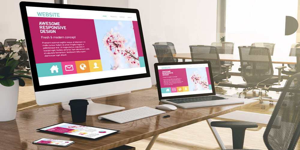
- Responsive Design: With mobile usage surpassing desktop, it’s vital that websites function seamlessly on any device. Adopting a mobile-first approach ensures accessibility and usability across different screen sizes.
- Visual Appeal and Functionality: Aesthetics play a crucial role in retaining user interest. However, this must be balanced with functionality. An attractive design should also be easy to navigate and interact with.
- Performance Optimisation: Speed and performance significantly impact user experience and SEO. Optimising website performance, such as reducing load times, is essential for maintaining user engagement.
- SEO Considerations: Proper structuring and content placement aid in search engine visibility. Good design is intertwined with SEO practices to ensure websites are easily discoverable.
The Connection Between Good Design and Measurable Business Outcomes
The correlation between good design and business outcomes is unequivocal. User-centric and visually appealing websites enhance user satisfaction, leading to increased engagement, longer visit durations, and higher conversion rates.
Moreover, a well-designed website is more likely to rank higher in search engine results, driving organic traffic and reducing reliance on paid advertising. Clear, intuitive navigation aids in reducing bounce rates while strategically placed calls-to-action (CTAs) guide users through the sales funnel.
By aligning website design with business objectives, companies can achieve measurable outcomes such as increased lead generation, higher sales, and improved customer retention. Ultimately, modern website design is not just about aesthetics; it’s a critical component of a comprehensive digital marketing strategy that drives tangible results.
These principles lay the groundwork for what makes modern website design effective. Building on this foundation, it’s essential to delve deeper into the role of user experience (UX) design in creating sites that truly resonate with users and support business goals. This exploration will begin with understanding how user-centric design principles drive engagement and conversions.
User Experience (UX) as the Foundation
How User-Centric Design Principles Drive Engagement and Conversions
Effective user experience (UX) design places the user at the centre of the design process, ensuring that their needs and preferences guide every decision. By understanding the target audience through detailed user research, designers can create intuitive interfaces that increase engagement and drive conversions. User-centric designs accomplish this by reducing friction, making it easier for users to find what they need and take desired actions. Consumers are more likely to interact positively with websites that feel tailored to their expectations, resulting in higher satisfaction and improved business outcomes.
The Importance of Intuitive Navigation and Information Architecture
Intuitive navigation is a cornerstone of UX design. Users should be able to move through a website seamlessly without confusion or unnecessary clicks. Well-crafted information architecture ensures that content is organised logically, making it easy for users to locate desired information quickly. Techniques such as breadcrumb navigation, clear menu structures, and search functionalities contribute to an organised and user-friendly website. Such intuitive structures enhance user retention by providing a hassle-free browsing experience that encourages repeat visits and conversions.
Balancing Aesthetics with Functionality for Optimal User Experience
The balance between aesthetics and functionality is crucial in modern UX design. Visually appealing websites attract users, creating a positive first impression. However, aesthetics should not compromise functionality. A website that looks good but performs poorly will frustrate users, potentially driving them away. Key to achieving this balance is ensuring that design elements such as colour schemes, typography, and layout enhance usability. For example, adequate white space can make content more readable, while consistent button styles can make actions clearer. The ultimate goal is to create a visually engaging website that is easy to use and navigate, thereby enhancing the overall user experience.
By meticulously integrating these UX elements, website designers can develop platforms that not only appeal visually but also function effectively, driving engagement and conversions. This foundational approach sets the stage for subsequent design elements that further refine the user experience, ensuring cohesive and impactful web interactions.
Visual Design Elements That Convert
Effective Use of Colour, Typography, and White Space to Guide Users
Effective visual design elements are crucial in modern website design, directly influencing user behaviour and engagement. Key among these elements are colour, typography, and white space. Each plays a significant role in guiding users, creating a seamless experience and driving conversions.
- Colour: Colours have psychological impacts that can trigger specific emotions and actions. For instance, blue often conveys trust and professionalism, making it popular in corporate website design. Conversely, red is used to create a sense of urgency or highlight important calls to action. The deliberate use of complementary colours can help create visual harmony, influencing user perception positively.
- Typography: The font choices made in website design are not just about aesthetics; they also impact readability and user engagement. Clear, easy-to-read fonts ensure that your content is accessible to a wide audience. Use varying font sizes and styles to create a visual hierarchy, drawing attention to the most important sections of your content.
- White Space: Often underestimated, white space—or negative space—significantly enhances readability and comprehension. By providing sufficient spacing around text and images, white space prevents a cluttered look, allowing users to focus on the key elements of your page without feeling overwhelmed.
The Psychology Behind Design Choices That Encourage Specific User Actions
Understanding the psychological underpinnings of design choices can lead to more effective websites that encourage desired user actions. Various design elements tap into subconscious cues that guide user behaviour.
- Colour Psychology: As previously mentioned, different colours evoke different emotional responses which can influence user actions. For instance, green often signifies growth or success, making it a good choice for call-to-action buttons.
- Visual Hierarchies: Setting a clear visual hierarchy directs users’ attention to where it is needed most. By making use of size, colour, positioning, and contrast, designers can guide the user’s journey through the site, leading them toward conversion points like signing up or making a purchase.
- Aesthetic Consistency: Consistency in visual elements—such as consistent use of colours, fonts, and button styles—reduces cognitive load, making your website easier to navigate. It also reinforces brand identity, which can instil greater trust.
Implementing Visual Hierarchies That Support Business Objectives
To achieve specific business objectives, implementing effective visual hierarchies is essential.
- Primary and Secondary Actions: Highlight primary actions with bold colours or prominent placement and use contrasting but less dominant styles for secondary actions. This approach ensures that users instinctively know what the main objectives are, such as making purchases or subscribing to a newsletter.
- Content Prioritisation: Arrange content in a way that starts with the most critical information at the top, followed by supporting details. This respects users’ time and immediately points them to key actions.
- Directional Cues: Employ directional cues like arrows or images of people looking towards significant information. These cues subconsciously guide users’ eyes towards desired elements or actions.
Combined, these visual design elements contribute to creating a website that is not only visually appealing but also strategically designed to drive digital marketing results. As each element complements the others, they collectively enhance user engagement and guide users seamlessly towards conversion points.
Understanding and harnessing these elements will prepare you for the next topic: creating content that resonates with your audience to further drive engagement and conversions.
Responsive Design and Mobile Optimisation
Why Mobile-First Design Approaches Are Essential in Today’s Market
As mobile device usage continues to surge globally, designing with a mobile-first approach is no longer optional but essential. Users expect seamless and responsive experiences across all devices, making it critical that websites are optimised for mobile. The mobile-first methodology ensures that the design scales up from smaller to larger devices, maintaining functionality and aesthetics. With search engines prioritising mobile-friendly sites in their rankings, a mobile-first design is also pivotal for SEO performance and visibility.
Techniques for Ensuring Consistent Experiences Across All Device Types
Achieving a consistent user experience across multiple device types involves several key techniques.
- Fluid Grids: Utilising fluid grids allows websites to adapt and reorganise content in accordance with different screen sizes, ensuring a coherent layout on all devices.
- Flexible Images: Implementing responsive images that adjust to various screen dimensions prevents layout breaking and ensures optimal visual appeal.
- Media Queries: Incorporating CSS media queries enables the application of specific styles depending on the device’s characteristics, such as width, height, or orientation. This customisation ensures a cohesive user experience regardless of the device used.
How Responsive Design Impacts SEO and User Engagement Metrics
Responsive design positively influences SEO and user engagement metrics by providing a seamless browsing experience, which leads to longer user sessions and lower bounce rates. Search engines like Google utilise mobile-first indexing, meaning a well-optimised mobile site can significantly enhance search engine rankings. Consistent performance across devices ensures that users can effortlessly navigate the site, increasing interaction and conversion rates. Furthermore, a unified URL structure for responsive sites simplifies crawling and indexing by search engines, bolstering overall SEO efforts.
By prioritising responsive design and mobile optimisation, businesses can enhance user experience and boost digital marketing results, laying a strong foundation for a successful online presence.
Content Strategy for Modern Websites
Creating an effective content strategy is crucial for modern website design. In today’s digital landscape, content must resonate with user needs as well as align with search intents to ensure visibility and engagement.
Creating Compelling Content That Aligns with User Needs and Search Intent
To begin, understanding the target audience is paramount. Content should address the pain points, interests, and questions of the users. This can be achieved by conducting thorough audience research, utilising tools like Google Analytics to gather insights. Additionally, optimising content to match search intent ensures that it appears in relevant search queries, enhancing its discoverability. Keywords should be strategically selected based on user intent, which could be informational, navigational, or transactional.
Strategic Content Placement and Formatting for Maximum Impact
To captivate and retain users, content must be effectively placed and formatted. Key points should be highlighted through headings, bullet points, and short paragraphs to enhance readability. Visual aids such as images, infographics, and videos also play a significant role in breaking up text and keeping users engaged. Above all, critical information should be placed above the fold to ensure it captures immediate attention.
Integrating Storytelling Elements with Conversion-Focused Messaging
Combining storytelling with conversion-focused messaging creates a compelling narrative that guides users towards desired actions. Storytelling adds an emotional layer to the content, making it more relatable and memorable. This can be interwoven with clear calls-to-action (CTAs) that guide users towards making a purchase, signing up for a newsletter, or any other conversion goal.
An effective content strategy requires continuous evaluation and iteration. Reviewing engagement metrics and user feedback will help in refining the content to better meet user needs and achieve business objectives.
Technical Foundations for Performance
The Critical Relationship Between Site Speed and User Retention
Site speed is a fundamental aspect impacting user retention. A slow-loading website can frustrate visitors, leading them to abandon the site before it even completes loading. Studies have shown that even a one-second delay in page load time can result in a significant drop in conversions. Speed not only affects user satisfaction but also influences search engine rankings and overall website performance.
Implementing Clean HTML and CSS Practices for Better Maintainability
Utilising clean HTML and CSS practices is crucial for maintaining a fast, efficient, and scalable website. Clean code ensures that the website remains easily navigable for both developers and search engines. It involves writing semantic HTML, which improves accessibility and SEO, along with modular CSS that reduces redundancy. Adopting these practices simplifies debugging, facilitates future updates, and enhances overall performance.
Balancing Rich Media with Performance Considerations
While rich media such as high-quality images and videos can enhance user engagement, they can also negatively impact site speed if not managed properly. Implementing strategies such as lazy loading, image compression, and using suitable file formats can help balance media richness with performance. Optimising rich media ensures that websites not only look appealing but also load quickly, providing a seamless experience for users across devices.
Balancing technical excellence with performance presents a continuous challenge yet managing these aspects effectively forms a robust foundation for a successful digital presence.
This concludes our deep dive into the technical foundations essential for a high-performing modern website.
WordPress as a Modern Design Platform
Leveraging WordPress Capabilities for Custom, Responsive Designs
WordPress stands as a versatile platform, empowering designers to create custom, responsive websites tailored to specific business needs. By utilising its extensive theme library and customisation options, designers can build unique and functional sites that deliver a consistent experience across all devices. Implementing themes that are both visually appealing and technically robust helps ensure that sites remain adaptable and user-friendly.
Best Practices for Theme Development and Customisation
When developing and customising themes on WordPress, adhering to best practices is paramount. A few key principles to consider include:
- Responsive Design: Ensure that themes are inherently responsive, adapting seamlessly to various screen sizes without sacrificing functionality or aesthetics.
- Clean Code: Maintain clean, well-documented code to facilitate easier updates and troubleshooting. This approach enhances site performance and security.
- Modularity: Develop themes with modular structures, allowing easier integration of new features and functionalities without extensive rework.
Following these practices ensures that WordPress themes are both effective and maintainable, providing a solid foundation for ongoing site improvements.
Plugins and Tools That Enhance Design Without Compromising Performance
WordPress’s vast ecosystem of plugins offers numerous tools to enhance website design. However, it is crucial to balance these enhancements with performance considerations. Some valuable plugins include:
- Elementor: A powerful page builder that allows for intricate designs without requiring extensive coding knowledge.
- Smush: An image optimisation plugin that compresses images without losing quality, thereby improving load times.
- W3 Total Cache: Enhances site performance through caching, reducing load times and boosting overall user experience.
Using these tools judiciously helps maintain optimal site performance, ensuring that design enhancements do not come at the expense of speed and usability.
Embracing WordPress as a core design platform enables the creation of dynamic, responsive websites that meet modern expectations for performance and customisation. This strategic approach ensures that businesses can continually adapt and evolve their digital presence to meet the ever-changing demands of their audience.
E-commerce Design Considerations
Effective e-commerce design is pivotal in driving purchase decisions and enhancing the overall shopping experience. This chapter explores specific design elements that influence user behaviour, strategies for presenting products in a compelling manner, and techniques to optimize the checkout process, ultimately reducing abandonment rates.
Specific Design Elements That Drive Purchase Decisions
To convert browsers into buyers, certain design elements must be strategically implemented. These include:
- Clear Call-to-Action (CTA) Buttons: CTAs should be prominent, using contrasting colours and concise, action-oriented text like “Buy Now” or “Add to Cart”.
- High-Quality Product Images: Multiple angles, zoom functionality, and high-resolution images help users better understand the product and feel confident in their purchase decision.
- Detailed Product Descriptions: Provide comprehensive information about the product, including features, benefits, and specifications. This reduces uncertainty and answers potential questions upfront.
Product Presentation Strategies That Increase Conversion Rates
How products are presented on an e-commerce site can significantly impact conversion rates. Effective strategies include:
- Customer Reviews and Ratings: Displaying customer feedback enhances credibility and provides social proof, influencing purchase decisions positively.
- Highlighting Promotions and Discounts: Eye-catching banners or labels indicating sales, discounts, or special offers can entice users to make a purchase.
- Product Videos and 360-Degree Views: These dynamic presentation methods provide a more interactive experience, allowing users to see the product in action.
Checkout Optimization Techniques That Reduce Abandonment
The checkout process is a critical touchpoint where many potential sales are lost. To minimize abandonment:
- Simplified Checkout Flow: Reduce the number of steps required to complete a purchase. Guest checkout options and single-page checkouts can significantly streamline this process.
- Progress Indicators: Show users how far they are in the checkout process. This transparency helps manage user expectations and reduces frustration.
- Trust Signals and Security Badges: Displaying trust seals, accepted payment methods, and secure transaction symbols reassures users of their data safety.
By focusing on these key elements and strategies, e-commerce websites can enhance the user experience, driving higher conversion rates and reducing checkout abandonment. Understanding and implementing these considerations is vital in creating an effective e-commerce platform that meets business objectives and satisfies user expectations.
SEO and Design: The Critical Intersection
The intersection of SEO and design is critical for modern websites seeking to maximise online visibility and user engagement. The visual and structural design choices you make can significantly impact how search engines perceive and rank your site. Effective design decisions enhance search engine visibility, creating a seamless user experience that encourages higher engagement and better business outcomes.
Design Decisions Impacting Search Engine Visibility
Good design isn’t just about aesthetics; it’s about creating a balance between visual appeal and functionality. Design elements like mobile friendliness, site speed, intuitive navigation, and clean layouts directly influence how search engines evaluate your site. For instance, a responsive design ensures your site performs well on any device, aligning with Google’s mobile-first indexing approach. Optimised images and multimedia reduce load times, a critical ranking factor as search engines prioritise fast, user-friendly sites.
Structuring Content and HTML for Optimal Crawling and Indexing
Search engines rely on crawlers to navigate and index your site. Structuring your content and HTML correctly is paramount for efficient crawling. Use semantic HTML tags, such as <header>, <footer>, <article>, and <section> to provide context to your content. Organising your content with clear headings (<h1> to <h6>) enables search engines to understand your site’s hierarchy and relevance. Include a sitemap and use canonical tags to guide crawlers to your most important pages and avoid duplicate content issues.
Technical SEO Considerations in Modern Website Architecture
A solid technical SEO foundation supports all other design efforts. Implementing clean code and avoiding heavy scripts ensures your site remains performant. Follow best practices for internal linking to create a coherent navigation structure that both users and search engines can easily follow. Additionally, regularly audit your website for broken links, 404 errors, and ensure proper use of robots.txt to guide search engine crawlers.
Investing in technical enhancements like schema markup can improve search engine understanding of your content, potentially leading to rich results in search listings. Ensuring that your site’s HTTPS status is properly configured further enhances site security, a ranking signal for search engines.
By carefully aligning your design and SEO strategies, you create a robust online presence that not only attracts but retains users, fostering long-term growth and success in the digital landscape.
Analytics and Continuous Improvement
Setting Up Meaningful Tracking to Evaluate Design Effectiveness
To optimise your website design continuously, setting up meaningful tracking mechanisms is vital. Implementing analytics tools such as Google Analytics or Hotjar enables you to collect user behaviour data systematically. Key performance indicators (KPIs) such as bounce rates, session durations, conversion rates, and click-through rates should be tracked meticulously. Such data offer invaluable insights into how users interact with your site, highlighting areas for improvement and driving design decisions based on real-world usage.
Interpreting User Behaviour Data to Inform Design Iterations
Once data is collected, the challenge lies in interpreting it effectively. User behaviour data can reveal pain points, such as areas where users drop off or elements that drive engagement. For example, high bounce rates on specific pages may indicate a need for improved content or design adjustments. Regularly reviewing heatmaps and session recordings can also provide deeper insights into user interactions. By understanding these behaviours, you can make informed design changes that enhance user experience and drive better outcomes.
A/B Testing Methodologies for Ongoing Optimisation
A/B testing is a powerful methodology for continuous design optimisation. By comparing two versions of a webpage with varied elements (such as headlines, calls-to-action, or layouts), you can determine which version performs better. This iterative process allows you to make data-driven decisions, refine your website design incrementally, and improve user engagement and conversion rates. Continuous A/B testing ensures that your website evolves in line with user preferences and market trends.
By setting up robust tracking systems, effectively interpreting user data, and employing A/B testing, you lay the groundwork for a website that can continually improve and adapt.
Accessibility as a Design Imperative
Why Inclusive Design Matters for Both Ethics and Business Results
Inclusive design ensures that digital interfaces are accessible to all users, including those with disabilities. This approach not only meets ethical obligations but also opens up your site to a broader audience, driving engagement and potential conversions. Legal mandates, such as the Americans with Disabilities Act (ADA) and the UK Equality Act, compel businesses to adopt accessible design. Beyond compliance, companies benefit from enhanced brand reputation and customer loyalty, as inclusivity creates a more welcoming environment.
Implementing WCAG Guidelines Without Compromising Aesthetics
The Web Content Accessibility Guidelines (WCAG) provide a framework for making web content more accessible. Implementing these standards involves principles such as perceivable, operable, understandable, and robust content. Ensuring text alternatives for non-text content, providing captions for multimedia, and designing accessible navigation are key steps. Importantly, these guidelines can be integrated without sacrificing visual appeal. Designers can employ high-contrast colour schemes, larger font sizes, and more readable typefaces while maintaining an aesthetically pleasing interface.
How Accessibility Improvements Often Benefit All Users
Accessibility improvements, while aimed at aiding those with disabilities, frequently enhance the overall user experience. Features like larger buttons, voice search optimisation, and simplified navigation can benefit all users, making interactions smoother and more efficient. Additionally, accessible sites often exhibit better performance across various devices and connectivity speeds, due to streamlined code and optimised content. Consequently, prioritizing accessibility results in a more user-friendly design for everyone.
Bringing together these elements of inclusive design paves the way for a more engaging and effective digital presence.
Integrating Social Proof and Trust Signals
Strategic Placement of Testimonials, Reviews and Trust Indicators
Integrating social proof and trust signals into your website design is crucial for establishing credibility and fostering trust with users. Testimonials, reviews, and trust indicators should be strategically placed throughout your site to maximise their effectiveness. Place customer testimonials prominently on your homepage and key product pages. Star ratings and user reviews should be visible near product descriptions and call-to-action (CTA) buttons to encourage decision-making at critical points.
Use trust badges, such as security seals and industry certifications, near CTAs to reinforce the reliability of your site. Highlight these elements prominently during the checkout process to reduce user hesitation and cart abandonment. The right placement of social proof and trust signals can significantly enhance user confidence and promote conversions.
Designing for Social Sharing and Community Engagement
Designing for social sharing and fostering community engagement are pivotal for amplifying your digital presence. Incorporate easily accessible social media sharing buttons on blog posts, product pages, and other relevant content. This encourages users to share your content, extending its reach organically.
To foster a sense of community, integrate user-generated content (UGC) sections where visitors can post reviews, comments, or images featuring your products. A well-designed community area can enhance user experience by making your site a platform for interaction, thus fostering loyalty and repeat visits.
Visual Cues that Reinforce Brand Credibility and Authority
Visual cues play a vital role in reinforcing your brand’s credibility and authority. Employ consistent branding elements, such as logos, colour schemes, and typography, to create a cohesive, professional appearance. Use authoritative imagery—such as photographs of your team, behind-the-scenes shots, or images of real customers using your products—to humanise your brand and build trust.
Visual endorsements from recognised personalities or industry experts can further cement credibility. Integrating these elements in a thoughtful, non-intrusive manner ensures that they add value without overwhelming the user.
By effectively leveraging social proof, trust signals, and visual cues, you can create a website that not only attracts but retains users, driving meaningful engagement and conversions.
Future-Proofing Your Website Design
To ensure your website remains effective and relevant in the ever-evolving digital landscape, designing with scalability and flexibility in mind is crucial. This future-proofing approach helps to accommodate changes in user behaviour, technology advancements, and market trends.
Designing with Scalability and Flexibility
Scalability allows your website to grow alongside your business, handling increased traffic and content without compromising performance. Flexibility ensures your site can adapt to new functionalities, design trends, and user needs.
- Modular Design: Employing a modular design strategy allows for easier updates and modifications. Each section of your website functions independently, making adjustments more manageable and cost-effective.
- Clean Code Practices: Avoid bloated code that can slow down performance and make future updates more challenging. Utilising clean, well-organised HTML, CSS, and JavaScript can significantly improve maintainability.
- Dynamic Content Management: Implementing a robust content management system (CMS) such as WordPress can facilitate content updates, theme changes, and plugin integrations without extensive development work.
Emerging Trends and Technologies
Staying ahead of emerging trends and technologies is vital for future-proofing. Here are some key areas to monitor:
- Artificial Intelligence (AI) and Machine Learning (ML): Integrating AI and ML can enhance personalisation, automate customer service through chatbots, and offer insightful data analysis for improved decision-making.
- Voice Search Optimisation: With the rise of voice-activated devices, optimising your website for voice search can improve accessibility and user experience. Focus on natural language processing and incorporating long-tail keywords.
- Augmented Reality (AR): Especially relevant for e-commerce, AR can offer immersive experiences, such as virtual try-ons and interactive product visualisation.
- Progressive Web Apps (PWAs): Bridging the gap between web and mobile apps, PWAs offer the benefits of both, providing a fast, reliable, and engaging user experience.
Building a Framework for Continuous Design Evolution
Adopting a framework for continuous evolution ensures your website adapts over time without significant overhauls. Regularly evaluate and refine your design based on user feedback and performance metrics.
- A/B Testing: Regular split testing helps identify the most effective design elements, improving user experience and conversions incrementally.
- User Feedback Integration: Actively seek and incorporate feedback from users to identify areas for improvement and ensure your site meets their needs.
- Performance Monitoring: Consistently monitor site speed, uptime, and user engagement metrics to address any issues proactively.
By embracing scalability, staying informed about emerging technologies, and committing to continuous improvement, you can future-proof your website design, ensuring long-term success and resilience in the digital marketplace.
Conclusion: Bringing It All Together
In bringing together the essential principles of effective modern website design, it is clear that a holistic approach is imperative for driving impactful marketing results. The interconnectedness of design elements, user experience, content strategies, technical foundations, and future-proofing techniques collectively contribute to delivering compelling digital experiences.
Recap of Essential Principles
Developing websites that are visually engaging, functionally robust, and user-centric drives both engagement and conversions. Key principles include:
- User Experience (UX): Ensuring intuitive navigation, responsive design, and accessibility to meet users’ needs.
- Visual Design Elements: Employing strategic use of colours, typography, and visual hierarchies that guide user actions and support business objectives.
- Responsive Design: Prioritising mobile-first design approaches that ensure consistent, seamless experiences across all devices.
- Content Strategy: Creating high-quality content that aligns with user search intent and business goals.
- Technical Foundations: Balancing performance with rich media and ensuring optimal site speed for better user retention.
- Platform Utilisation: Leveraging platforms like WordPress for scalable, customisable, and performance-oriented designs.
The Holistic Approach
Effective website design is not about focusing on individual elements in isolation. Instead, it involves an integrated approach where each component enhances and complements the other. This holistic methodology ensures that:
- User Experience: Is enhanced through engagement-driven design, seamless navigation, and accessibility.
- Design Consistency: Is maintained across devices with responsive and mobile-first strategies.
- Content and Technical Performance: Align with user expectations and SEO best practices for improved visibility and engagement.
Actionable Next Steps
- Conduct User Research: Understand your audience’s needs, preferences, and pain points to tailor user-centric designs.
- Enhance Visual Appeal: Leverage colour schemes, typography, and white space effectively to create visually compelling layouts.
- Optimize Mobile Experience: Implement responsive design techniques and ensure mobile-first design to cater to the growing mobile user base.
- Create Quality Content: Develop content that is not only engaging but also fulfils search intent and user requirements.
- Ensure Technical Excellence: Focus on site speed, clean coding practices, and balancing rich media elements for optimal performance.
- Utilise Platforms: Use robust CMS platforms like WordPress to create scalable, flexible, and high-performing websites.
By adhering to these foundational principles and actionable strategies, you can create modern websites that not only look good but also deliver measurable business outcomes through enhanced user engagement, higher conversions, and improved SEO performance.